Flight Risk analytics allows you to identify concentrations of high turnover risk at the organizational level so you can take action to address employee concerns, improve engagement, and ultimately reduce turnover.
In this article:
The Flight Risk report is no longer supported. Instead, use the Retention Radar to identify concentrations of high turnover risk and proactively address flight risk. Learn more about the Retention Radar.
Overview
Employee turnover creates enormous costs for many organizations, so it's not surprising that many customers aspire to reduce regrettable turnover.
Flight Risk analytics allows you to identify concentrations of high turnover risk at the organizational level so you can take action to address employee concerns, improve engagement, and ultimately reduce turnover. Learn how to use survey comments to act against regrettable turnover.
How Flight Risk is Calculated
Flight Risk data is calculated by leveraging machine learning to detect patterns in the Engagement survey data of terminated employees to identify common drivers of turnover. The model then searches for the identified patterns across your employee population and assesses employee tenure before categorizing employees by risk level, i.e. High, Average, and Low risk.
To protect employee confidentiality and encourage honest and productive responses in future surveys, the model requires a minimum of five responses before it can start predicting risk levels.
As an additional layer of security, an individual's identity and risk level can not be isolated. Risk levels for any group are not shared if there are less than five employees.
Requirements
- Your organization must have conducted an Engagement survey with Quantum Workplace
- Access to new hire and exit dates, via an HRIS integration or an updated user file
Access Flight Risk Analytics
To access Flight Risk analytics:
- Click and expand Analytics in the left-hand navigation menu
- Click Flight Risk
Navigate Flight Risk Analytics
To get started and visualize Flight Risk data, click and expand Slice By (Figure D) and select a demographic.
To navigate Flight Risk analytics:
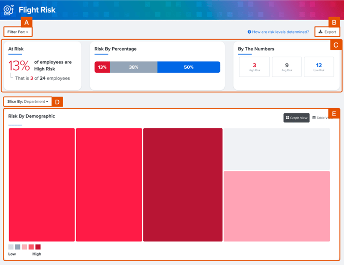
- A. Filter: Use the Filter ability to filter the data shown according to the selected demographic
- B. Export: Click to export Flight Risk data as an .xlsx file
- C. Flight Risk Dashboard: A visual summary of Flight Risk data according to the selected Slice By demographic
- At Risk: The number and percentage of employees categorized as High Risk for turnover
- Risk by Percentage: Visualizes the percentage of employees who fall under each risk level
- By the Numbers: Indicates the number of employees who fall under each risk level
- D. Slice By: Use the Slice By ability to slice Flight Risk and view risk data according to the selected demographic
- E. Graph & Table View: Additional methods of identifying where Flight Risk is concentrated; click Graph View and Table View to toggle between each view
Graph View
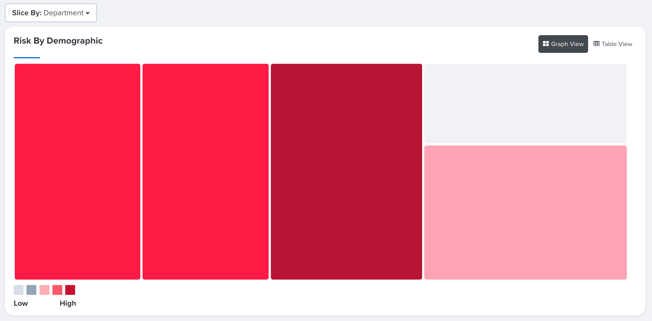
Use this graph view to visualize where flight risk may be concentrated among the selected demographic groups.
- Each box represents a demographic group and is color-coded to represent the group's relative turnover risk. The darker the color, the higher the risk.
- The size of each box represents the number of employees in the demographic group.
Click a box to update the Flight Risk dashboard (Figure C) cards with the selected demographic group's data
Use the Slice By drop-down menu to select and view the risk data for other demographics.
Table View
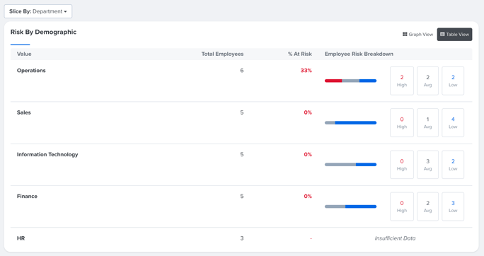
Use this graph to list the risk data for each demographic grouping.
Each row indicates the number of employees, the percentage of High-Risk employees, and the count for each risk level.
If a group has less than five employees, risk data is not shared for the entire group to protect confidentiality.