The Heat Map report helps visualize how different demographic groups compare to a benchmark. You will use the ‘Slice By’ option to compare different groups of employees.
In this article:
- Video: I'm a visual learner; show me how.
- Quick Step-by-Step: Give me the shortened version of what I need to know.
- Full Notes: I want an in-depth walk-through of the report's functionality.
- Tips & Tricks: What else should I know?
Videos: Watch & Learn
Quick Step-by-Step Notes
Filter
- Click on the Filter button.
- To filter by a demographic, scroll down and click on the demographic you want to filter by. Then click on the options you want to select them. Finally, click the Apply button.
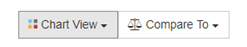
Chart View
- Click on the Chart View button.
- Pick the option you want to see – Favorable Responses, Average Result.
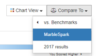
Compare
- Click on the Compare To button.
- Pick your option. You can pick your previous year if you’ve surveyed with us before, benchmarks, or your organization as a whole.
- You will see a pin for the comparison option you picked. Hover over it to see more details.
Full Notes
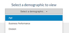
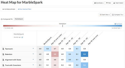
When you first land on the Heat Map report, you will be prompted to select a demographic (unless you already have a slice turned on).
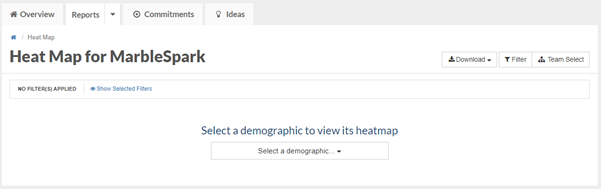
Click on the Select a demographic drop-down list and choose the option by which you want to slice.
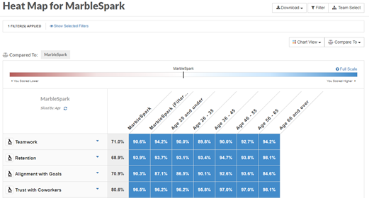
Then, click on the Compare To button and select your desired benchmark. In the example below, we selected MarbleSpark, our organization.
The Heat Map report will display each category in your survey in the far-left column. To the right, is the selected benchmark, and then each option under the chosen demographic.
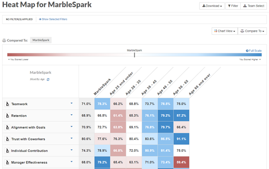
What do the colors mean?
The Heat Map is color-coded to provide an easy, visual representation of how each demographic compares to the benchmark. The darker the red, the lower the score is compared to the benchmark. The darker the blue, the higher the score is in comparison. To learn more about what each color means, click on the Full Scale link directly above the gradient bar at the top of the report.
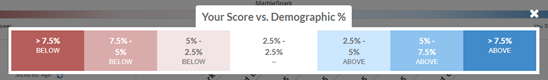
Chart View
Chart View works a little differently on the heatmap. By default, we still display favorable responses, however the only other option to select under Chart View is average results.
- Click on the Chart View button.
- Select the option you want to see.
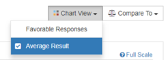
- The Heat Map report will update to show the option you picked.
Adding a Filter
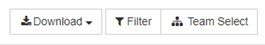
To focus further on a specific population, you can also apply a filter(s) to this report by clicking on the Filter button in the upper, right-hand part of the screen.
- To Filter by a demographic, click on the Filter button.
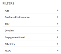
- Under Filters, click on the demographic to filter by.
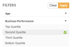
- Select the options for that demographic (Second Quartile in the example below) and then, click on the yellow Apply button.
- The Heat Map report will update based on the demographic you selected
- If you select two, or more, options for a specific demographic, the report will display the combined results for each option selected.
Tips & Tricks
- For the Heat Map report to work, you must have a slice turned on.
- The colors mean something! The darker the red, the lower the score compared to the benchmark. The darker the blue, the higher the score.
- You can combine slicing and filtering.
- You can apply as many filters as you like but can only slice by one demographic at a time.
- Don’t forget about our minimum threshold. If you filter down to fewer than 5 responses, you will get our insufficient responses message.
- To get rid of a filter, click on Filter again and then click on the Clear button.