In this article:
- Overview
- Useful Actions
- User Access
- Turnover Trends
- Turnover Comparison by Survey
- Flight Risk by Demographic
- Flight Risk Factors
- First Year Turnover
- Goal Reports
- Diversity & Inclusion
Overview
Quantum Workplace provides multiple dashboards for Intelligence Dashboard users.
This article serves as a guide through these dashboards and how to understand and best utilize their insight.
Useful Actions
When viewing any of your Intelligence Dashboards, there are several functions to be aware of that can be helpful when analyzing the dashboards.
- To reset a filter, click the corresponding eraser icon that is displayed when hovering over the filter, this is useful when making small adjustments to your dashboard views
- To reset an entire dashboard, click Clear Filters in the top-right corner
- To select multiple filters, hold the Control key (PC) or Command key (Mac) and click each desired filter
- In the bottom-left corner, if available, the Action tab is another great resource for best practices regarding the dashboard
User Access
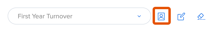
To configure user access to each Intelligence Dashboard, click the Edit User Access icon:
In the User Access modal, grant access to new users and configure settings:
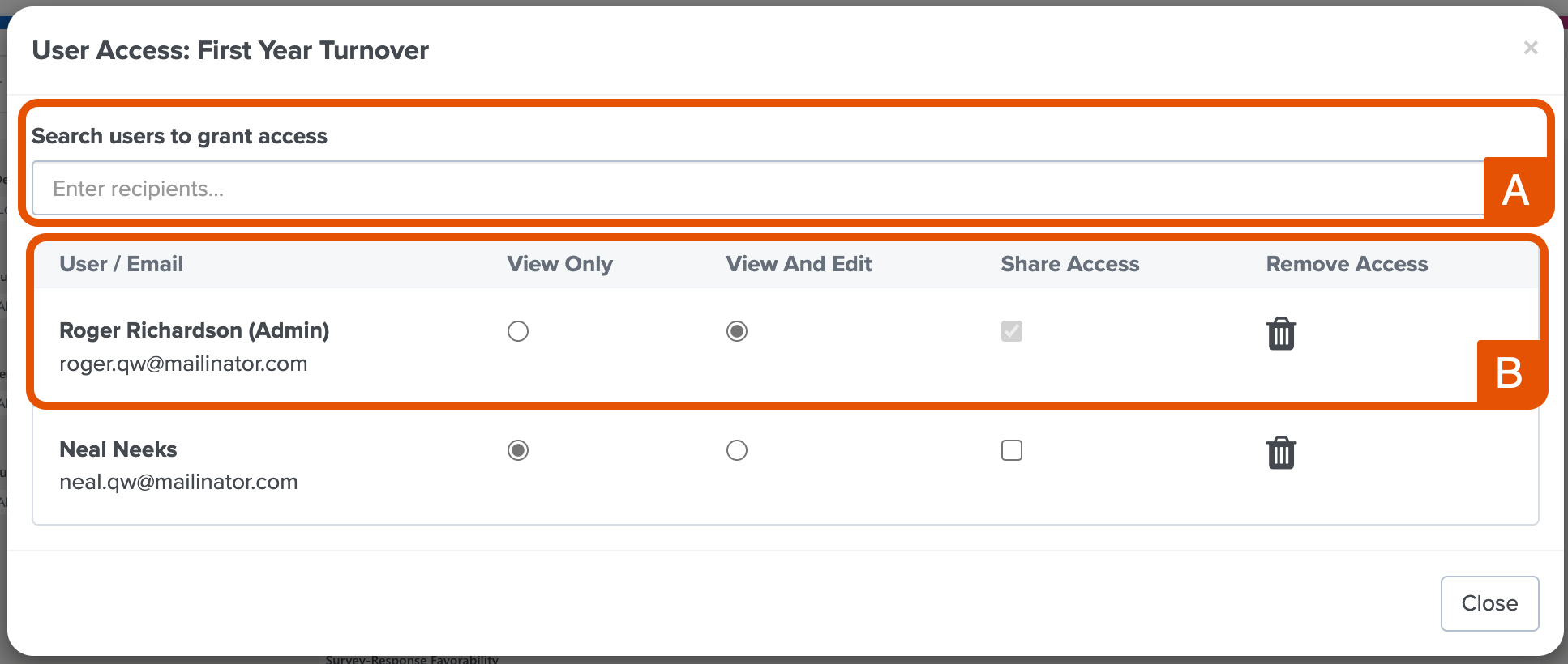
- A. Grant User Access: Enter and click the employee name in the search bar to grant the user access to the specific dashboard
- B. User Settings: For each user, enable/disable view, edit, and share permissions and remove a user's access
- Note: Users who are granted access to the dashboards have full visibility and are not subject to the same limitations of analytics across Quantum Workplace, e.g. Focused Admins, downline view of a manager, etc.
Turnover Trends
The Turnover Trends dashboard is useful for understanding historic turnover for your organization. This dashboard can also serve as a pulse check to measure the effectiveness of engagement initiatives your organization is running.
Many demographics change over time, i.e. age, tenure, etc., but the demographic data shown on the dashboard will be current.
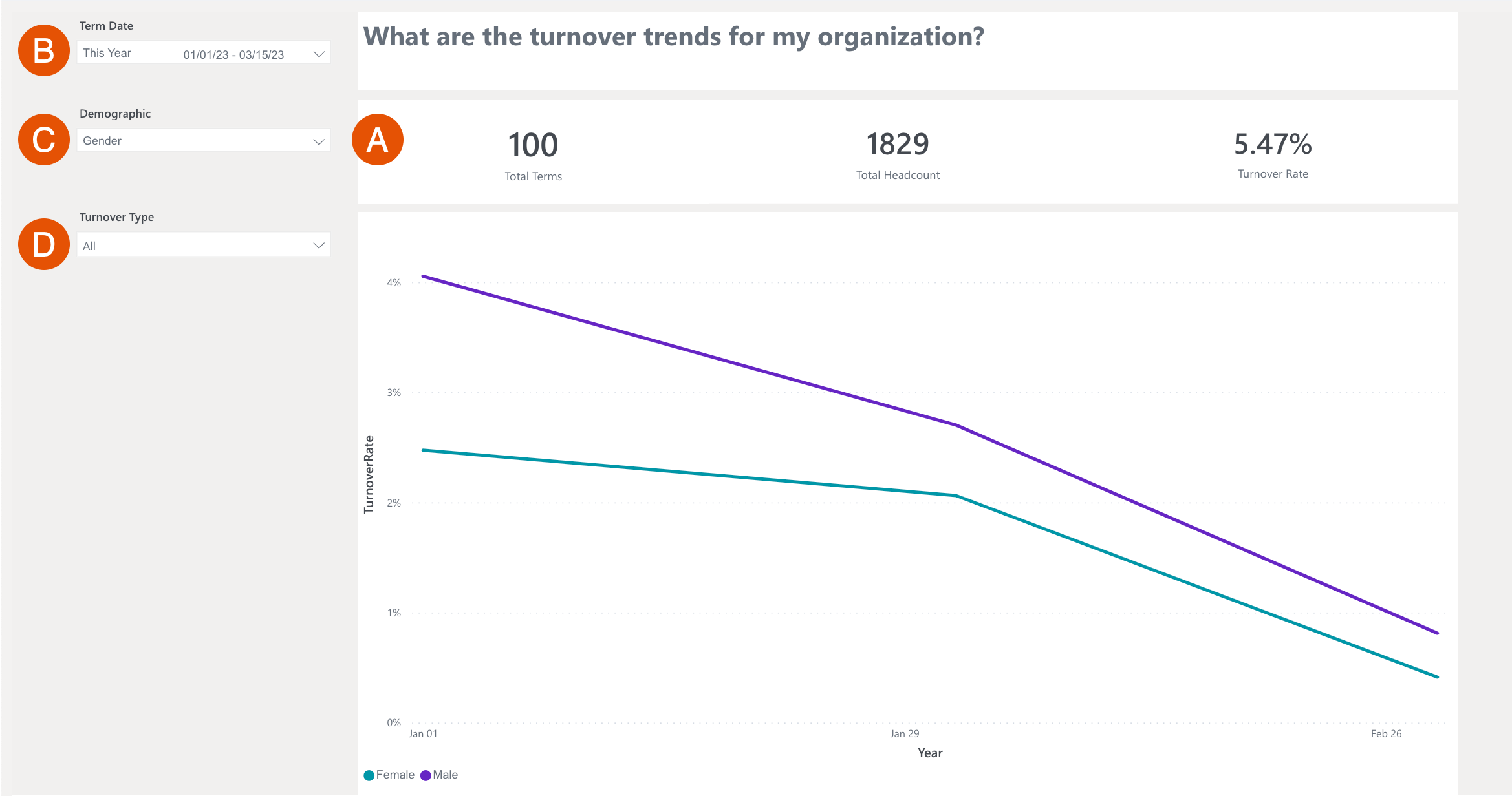
- A. Data: The top row displays data for Total Terminations, Total Headcount, and Turnover Rate
- The emphasis of this report is the trend over time, so the calculation of the turnover rate is kept simple: Total Terminations/ Total Headcount
- B. Term Date: Click and expand the drop-down to select a date range
- C. Demographic: Click and expand the drop-down to select the demographics to visualize in the graph
- Expand a demographic's drop-down menu to enable/disable sub-demographic attributes
- D. Turnover Type: Click and expand the drop-down to select the turnover type visualized in the graph
- When using Quantum Workplace's Exit Type demographic attribute, you have the option to filter for Voluntary, Involuntary, Not Terminated, and (Blank)
Requirements
The Turnover Trends dashboard requires:
- The Exit Date information for your organization's former employees
For reporting voluntary turnover, an HRIS integration is recommended to automatically communicate turnover data to Quantum Workplace. Alternatively, you can submit a User File with the demographic attribute, ExitType, included for your employees.
- Use ExitType 0 for voluntary turnover
- Use ExitType 1 for involuntary turnover
3 Ways to Leverage this Dashboard
- Look for trends that spike or dip during times of change within your organization
- For example: did turnover decline for certain roles or groups when you decided to implement a remote work or flexible work policy?
- Focus on key groups of employees that are most crucial to the success of your business, or costly to replace
- To make your analysis more valuable, make sure to include Performance data or other KPIs flowing over as demographics
- For example: are your top performers experiencing higher than average turnover compared to your average or below-average performers?
Turnover Comparison by Survey
The Turnover Comparison by Survey dashboard allows you to compare the favorability of a question from any survey in two categories- the favorability scores from current employees and terminated employees.
By looking at survey responses, sometimes employees will indirectly communicate that they will leave the organization. Learn to recognize these signs by comparing the responses of employees who left against those who have stayed.
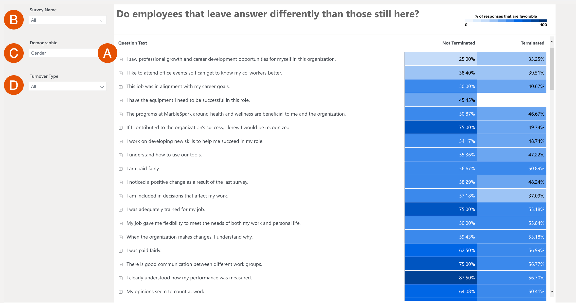
- A. Data: Displays the question as it appears in the survey and the question's favorability scores for Terminated and Not Terminated employees
- When viewing the Terminated column- the lighter the cell, the less favorable the responses are for that group; a large difference in favorability indicates that the question can help explain why an employee was terminated
- B. Survey Name: Displays the survey being reflected in the dashboard
- Click to expand this drop-down and select from your organization’s completed surveys
- C. Demographic: Displays the active demographic
- Click to expand the drop-down and select from your organization’s available demographics
-
- Click the □ icon to view the question by demographic.
For example: if you have an Office Location demographic, you can view how favorability varies office by office
- Click the □ icon to view the question by demographic.
- D. Turnover Type: Click and expand this drop-down to select which turnover type to reflect in the data.
- When using Quantum Workplace's standard ExitType demographic attribute, you will see options to filter for Voluntary, Involuntary, Not Terminated, and (Blank)
Requirements
The Turnover Comparison by Survey dashboard requires:
- The Exit Date information for your organization's former employees
- Have at least one survey launched with Quantum Workplace
For reporting voluntary turnover, an HRIS integration is recommended to automatically communicate that data to Quantum Workplace. Alternatively, you can submit a User File with the demographic attribute, ExitType, included for your employees.
- Use ExitType 0 for voluntary turnover
- Use ExitType 1 for involuntary turnover
3 Ways to Leverage this Dashboard
- Look for the largest gaps in experience where Active employees are significantly more or less favorable than those who have left the organization since the last engagement survey; use the shades of the heat map to identify items that stand out or feel the most actionable
- Look for similarities in experience between your Not Terminated and Terminated employees, items where both groups of employees responded similarly can mean one of two things:
- Both sets of employees had a positive experience here, additionally, this is something you can continue to leverage with new employees
- Both sets of employees had a neutral or negative experience here that may not specifically correlate to turnover but is worth giving some attention
- Layer on additional demographics to enhance the analytics as you may uncover fresh insights specific to unique groups
Flight Risk by Demographic
The Flight Risk by Demographic dashboard visualizes the risk of employees leaving your organization. This dashboard is useful to gauge where retention efforts should be focused.
To see employees who have already left, and the accuracy of the Flight Risk model, use the Employment Status filter to select Terminated. To view any remaining at-risk employees, select Not Terminated from the filter drop-down.
You must first select a survey from the Survey Reference Point to use this dashboard.
Note: If you are seeing blank spaces in the dashboard, a potential reason could be that a survey didn't meet the minimum number of responses. The data is intentionally left blank to protect the confidentiality of the respondents.
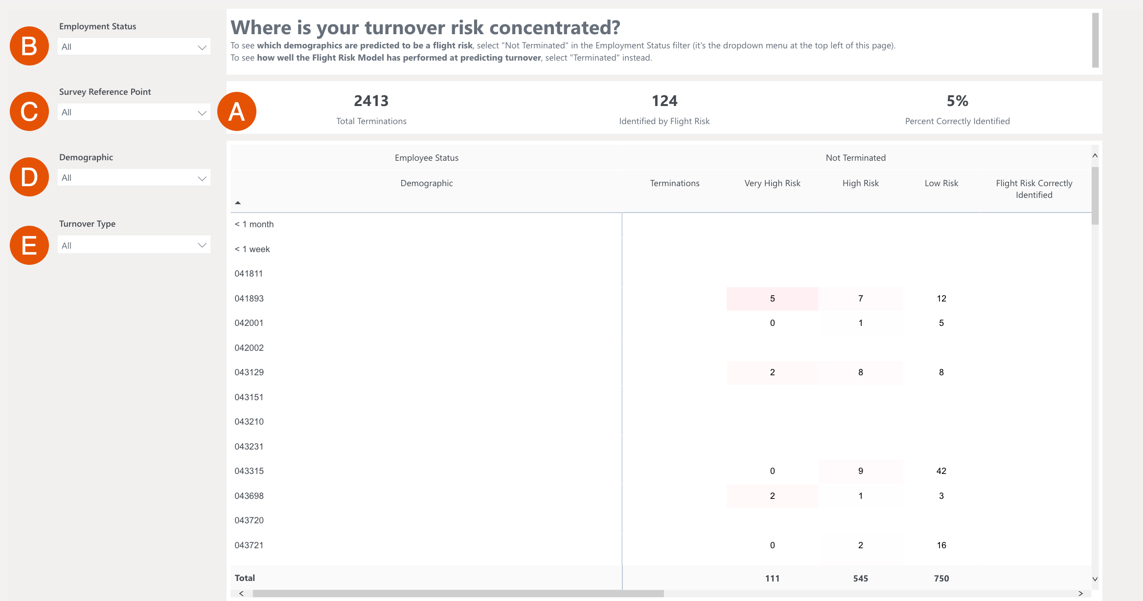
- A. Data: The top row displays the number of Total Terminations, Persons ID’d by Flight Risk, and the percentage that represents the flight risk model’s accuracy for your organization;
the table underneath will go into greater detail and display selected demographics and their corresponding risk level of leaving the organization.- The different risk categories can be summarized as follows:
- Low Risk: the employees have not indicated a significant risk
- High Risk: the employees have shown us there are some problems
- Very High Risk: the employees are clearly showing us there are problems
- The different risk categories can be summarized as follows:
- B. Employment Status: Filters the table data based on employee employment status
- Both Active and Terminated employees are enabled by default
- From the drop-down, select Not Terminated to view current employees by risk level; select Terminated to view the accuracy of our flight risk model for employees who have left
- C. Survey Reference Point: Filters the table data based on a specified survey
- Surveys used to make a flight risk model for your organization will be shown.
- It’s usually best to select the most recent survey or your last engagement survey; selecting older surveys can show how your risk factors have changed over time.
- D. Demographic: Filters the table data based on a specified demographic
- By default, all demographics are enabled
- E. Turnover Type: Click and expand this drop-down to select which turnover type to reflect in the data
Requirements
The Flight Risk by Demographic dashboard requires:
- A subscription to Quantum Workplace's Flight Risk tool
For reporting voluntary turnover, an HRIS integration is recommended to automatically communicate that data to Quantum Workplace. Alternatively, you can submit a User File with the demographic attribute, ExitType, included for your employees.
- Use ExitType 0 for voluntary turnover
- Use ExitType 1 for involuntary turnover
3 Ways to Leverage this Dashboard
- Check your 'hunches' - as an HR leader, you're likely aware of teams or departments struggling; this dashboard can help confirm or dispel whether the 'hunches' are true and the potential consequences if action isn't taken as it relates to future turnover
- Use the Employment Status filter to see the past and future value of the predictive tool
- IsolateTerminated indicates prediction accuracy
- Isolate Not Terminated indicates future turnovers might be most prevalent
- Start with the most recent engagement survey when evaluating where the highest concentration of flight risk is populated
Flight Risk Factors
The Flight Risk Insights dashboard visualizes the risk of employees leaving your organization by looking into your employee’s comments. This dashboard is useful for identifying the relationship between certain themes within your organization and an employee’s risk of leaving.
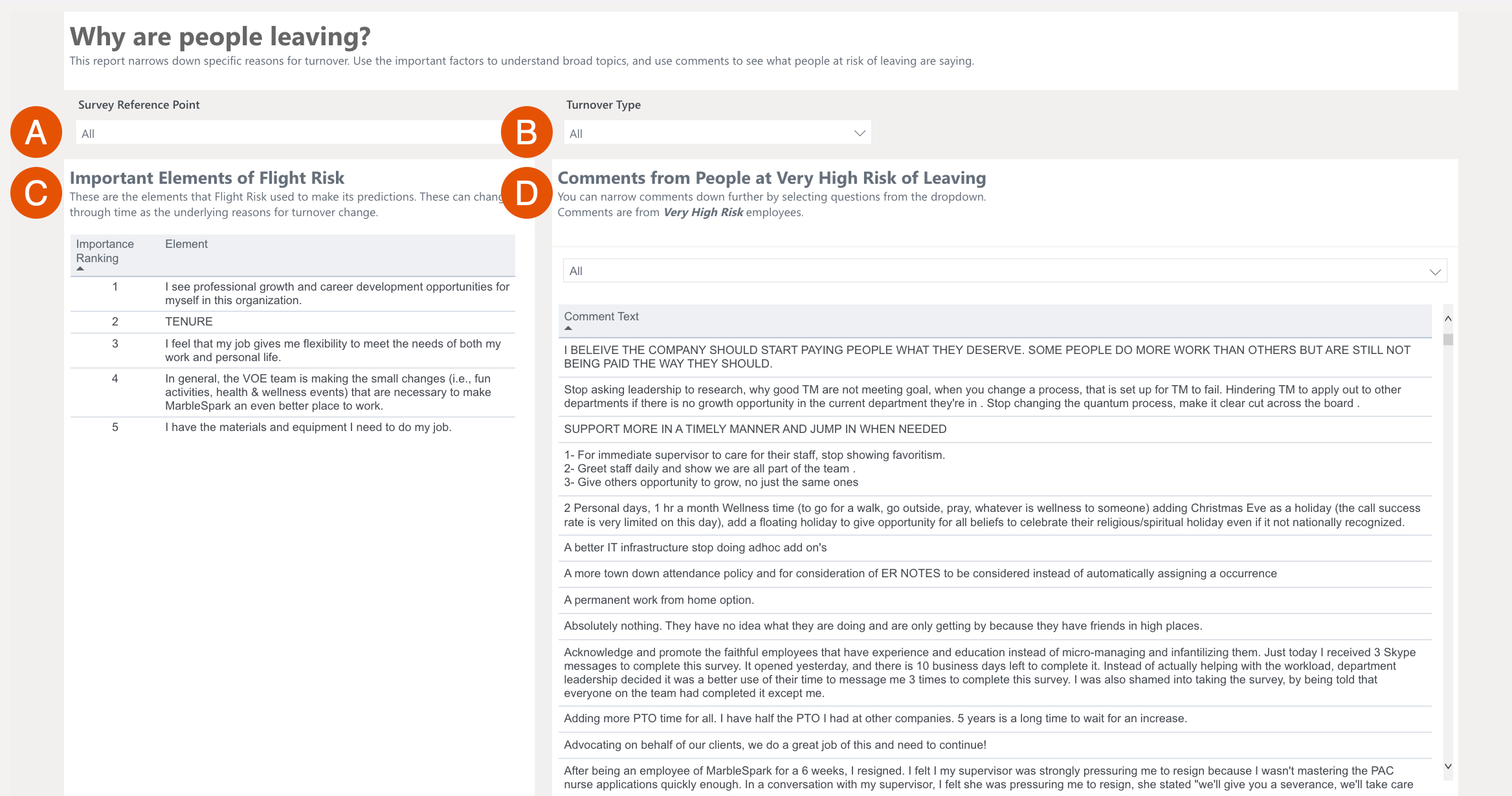
- A. Survey Reference Point: Filters the table data based on a specified survey
- Surveys used to make a flight risk model for your organization will be listed
- It’s usually best to select the most recent survey or your last engagement survey. Selecting older surveys can let you see how your risk factors have changed over time.
- B. Turnover Type: Click and expand this drop-down to select which turnover type to reflect in the graph
- C. Elements of Flight Risk: By order of significance, indicates underlying sources of flight risk and key areas to focus retention efforts
- D. Comments: Displays comments from the Survey Reference Point
- By default, all Very High Risk comments are displayed, but can be filtered by themes by clicking All and selecting a theme from the drop-down menu
Requirements
The Flight Risk Factors dashboard requires:
- A subscription to Quantum Workplace's Flight Risk tool
For reporting voluntary turnover, an HRIS integration is recommended to automatically communicate that data to Quantum Workplace. Alternatively, you can submit a User File with the demographic attribute, ExitType, included for your employees.
- Use ExitType 0 for voluntary turnover
- Use ExitType 1 for involuntary turnover
3 Ways to Leverage this Dashboard
- Compare the Important Elements of Flight Risk to the High Impact items from the latest engagement survey, the items that overlap provide signals to both, what drives engagement and what might drive turnover
- Pay attention to key demographics that appear on the list of Important Elements of Flight Risk, these demographics can signal important layers to consider when addressing talent changes
- Thoroughly review all of the comments on the report- these open-ended comments come directly from employees deemed 'very high risk' for leaving your organization, evaluate these comments for key themes and opportunities
First Year Turnover
The First-Year Turnover dashboard visualizes why employees leave during their first year. This dashboard is useful for identifying flight risk by looking at favorability discrepancies in survey questions.
- A. Data: The top row displays the data for the number of employees who exited their first year divided by the total number of exited employees to calculate the first-year turnover percentage
- The graph underneath visualizes data for First Year Turnover Rate by the active demographic.
- The Survey-Response Favorability table displays survey questions and their corresponding favorability rating by employees who exited their first year and those who stayed beyond their first year, regardless of tenure beyond their first year;
click a question to adjust the charts to reflect the selected question's data.
- B. Demographic: Filters the table data based on a specified demographic
- By default, all demographics are enabled
- C. Survey: Displays the active survey that is populating the data
- Click to expand this drop-down and select from your organization’s completed surveys
- D. Term Date: Filters the data to reflect terminated employees of the specified date(s), narrow term dates by years or specific quarters
- E. Turnover Type: Click and expand this drop-down to select which turnover type to reflect in the data
Requirements
The First Year Turnover dashboard requires:
- The Exit Date information for your organization's former employees
- Have at least one survey launched with Quantum Workplace
For reporting voluntary turnover, an HRIS integration is recommended to automatically communicate that data to Quantum Workplace. Alternatively, you can submit a User File with the demographic attribute, ExitType, included for your employees.
- Use ExitType 0 for voluntary turnover
- Use ExitType 1 for involuntary turnover
3 Ways to Leverage this Dashboard
- Look for the largest and smallest gaps between new hires who left in their first year and those who stayed beyond their first year; these gaps can uncover what needs to be enhanced or added for a more valuable onboarding experience for new hires
- Share findings from this dashboard with your Talent Development team and onboarding specialists as they are well-positioned to make changes and act based on your findings
- Use the Survey Reference Point drop-down to explore employee feedback across their lifecycle- starting with the latest engagement survey, then onboarding and new hire analytics, and finally, an exit survey to provide a well-rounded view of what impacted your employees that decided to leave
Goal Reports
The Goal Reports visualize data for your organization and employees' use of Quantum Workplace's Goals.
The different tabs available each represents a different aspect of goal usage by your organization.
Goal Overview Tab
The Goal Overview represents your organization's usage of Goals.
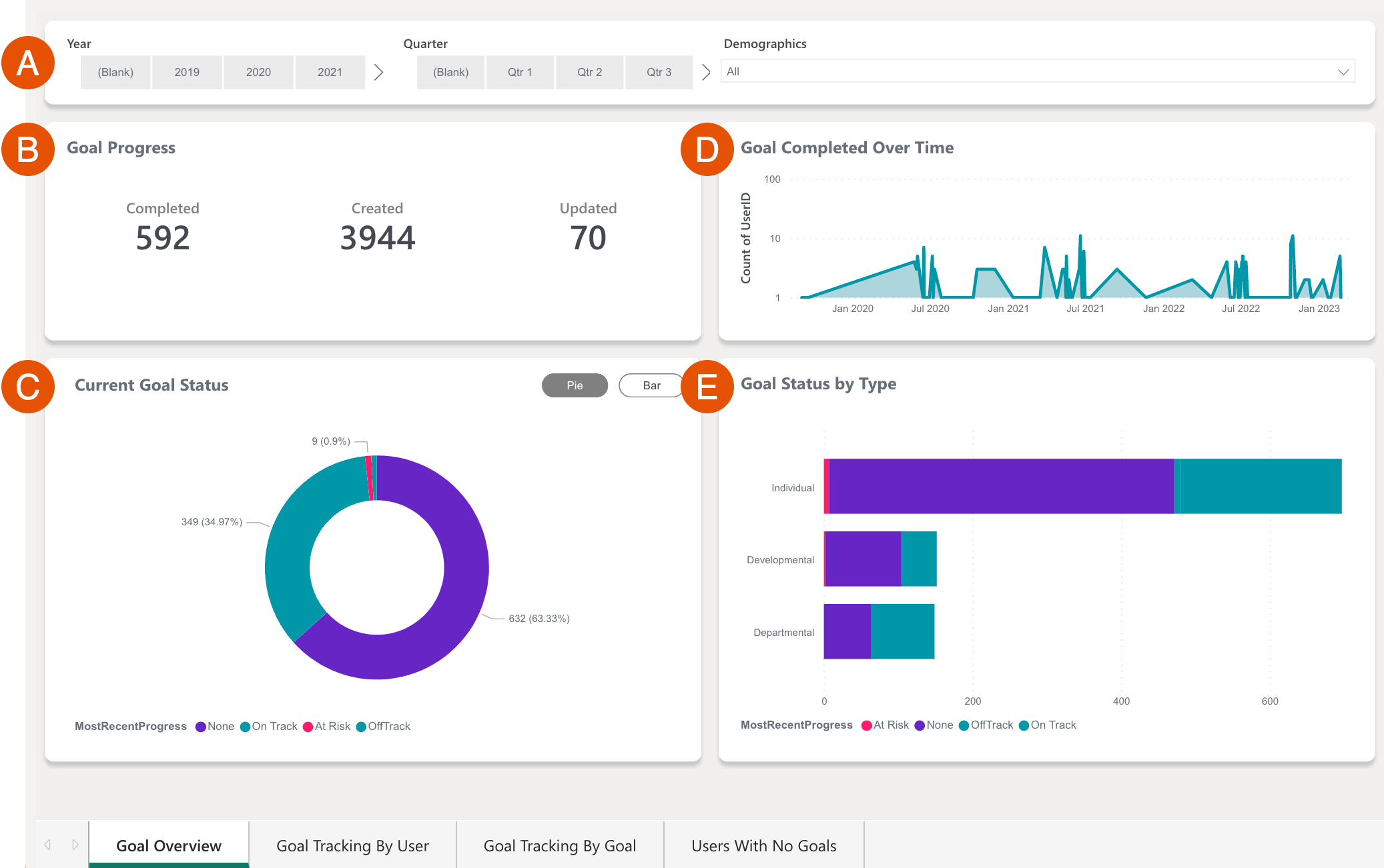
- A. Graph Settings: Optionally, configure these settings to view the data in Figures B-E with any active filters
- Year: Optionally, click a year to filter the data according to the selected date range
- Quarter: Optionally, click a quarter to filter the data according to the selected date range
- Demographics: Optionally, use the drop-down to select and filter the data according to the selected demographic(s)
- B. Goal Progress: Represents the number of Completed, Created, and Updated goals
- C. Current Goal Status: Visualizes the different statuses of active goals, i.e. On Track, At Risk, Off Track, via a pie or bar graph
- D. Goal Completed Over Time: Visualizes goal completion activity over time
- E. Goal Status by Type: Visualizes the different statuses of active goals by their goal type
Goal Tracking By User
For the specified goal or multiple goals, this report displays goal status by demographic and goal progress and amount for users.
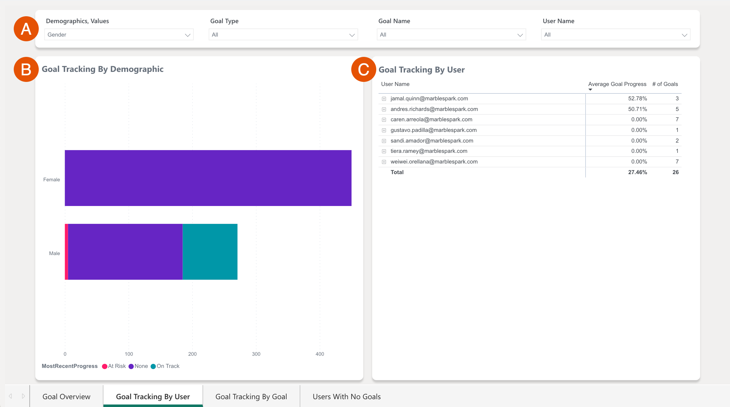
- A. Graph Settings: Configure these settings to view the data in Figures B and C with the active filters
- Demographics, Values: Click the drop-down to select which demographics to enable and reflect in the graphs
- Goal Types: Click the drop-down to select which goal types, i.e. Departmental, Developmental, etc. to enable and reflect in the graphs
- Goal Name: Click the drop-down to select which goal(s) to enable and reflect in the graphs
- User Name: Click the drop-down to select which user(s) to enable and reflect in the graph
- B. Goal Tracking by Demographic: Displays the selected demographic color-coded for each goal status
- C. Goal Tracking by User: Displays the selected user(s) and their corresponding average goal progress and the number of goals
Goal Tracking By Goal
For the specified goal or multiple goals, this report displays goal progress and the number of key results for a given goal.
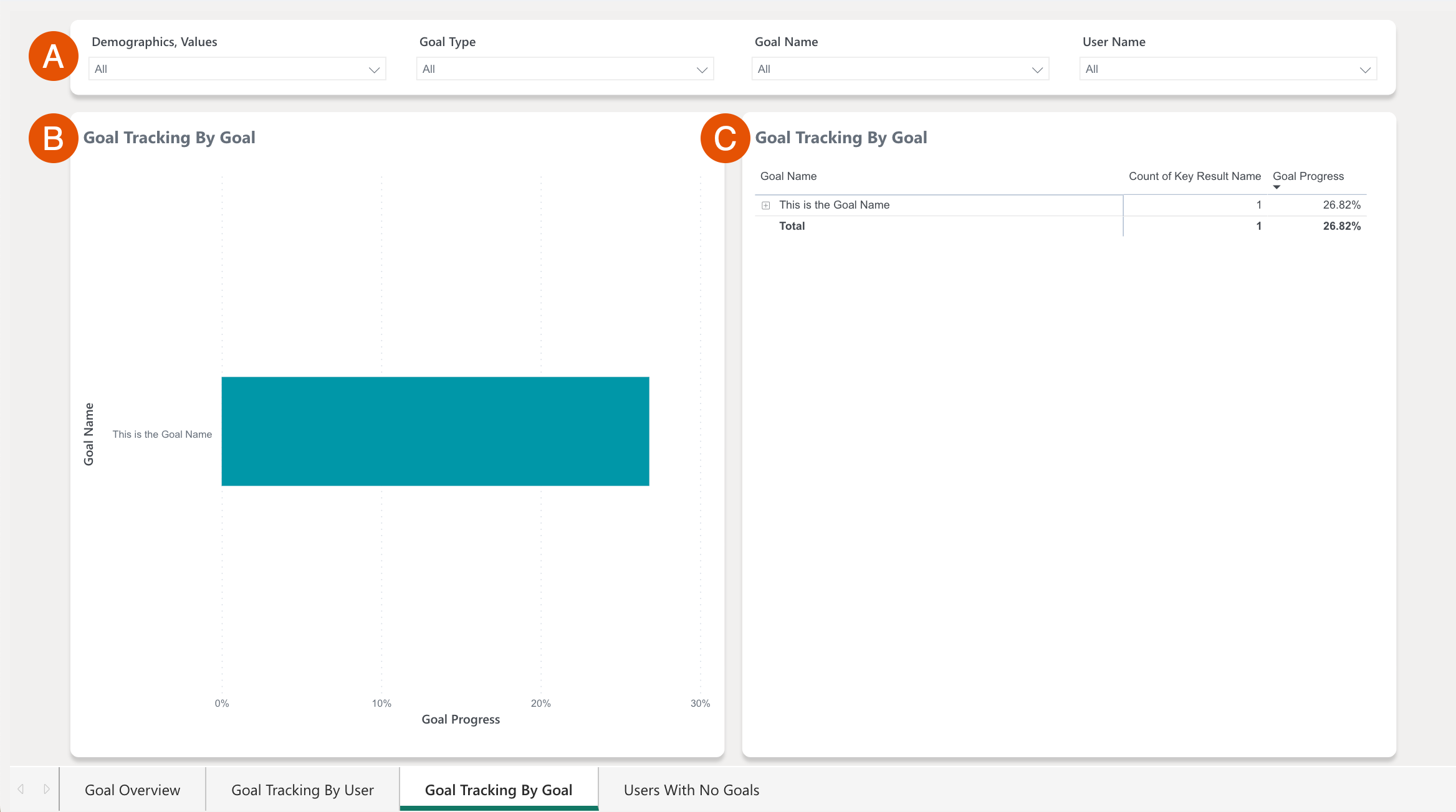
- A. Graph Settings: Configure these settings to view the data in Figures B and C with the active filters
- B. Goal Tracking by Goal: Displays the goal and its progress in the x-axis
- C. Goal Tracking by Goal: View the goal(s) with the corresponding number of key results and the overall progress
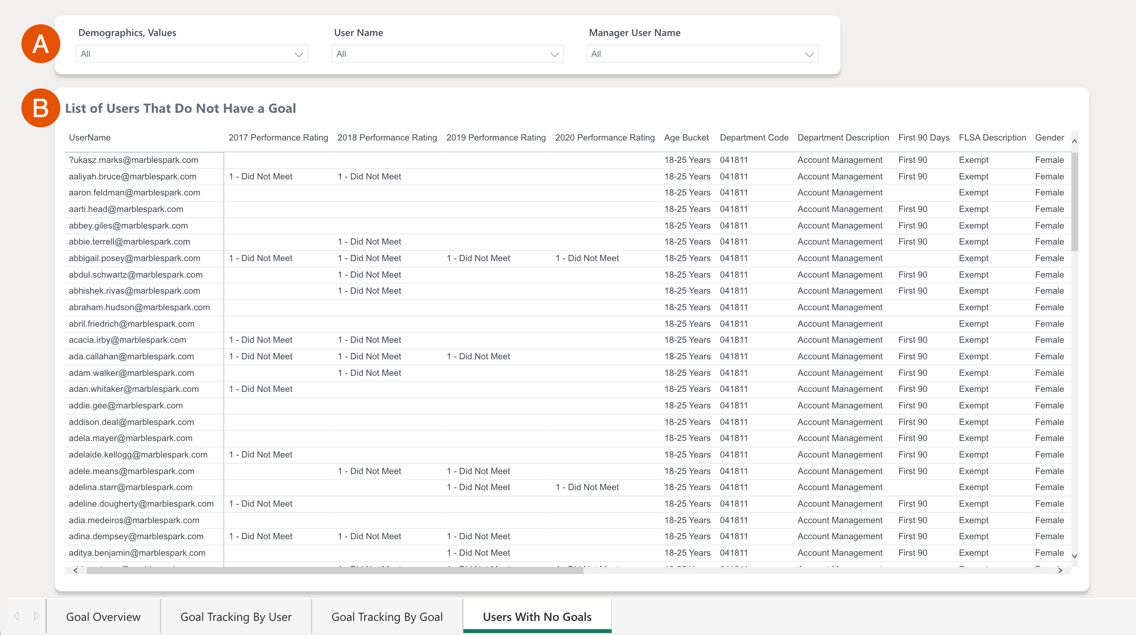
Users With No Goals
For the specified goal or multiple goals, this report displays the users without a goal in Quantum Workplace.
Diversity and Inclusion
Human Capital
The Human Capital tab presents several graphs that cover Favorability, Turnover, and Hires date filterable by Date, Demographics, and Values.
This report is useful for viewing how your employees might have different experiences and who/where these discrepancies might be coming from.
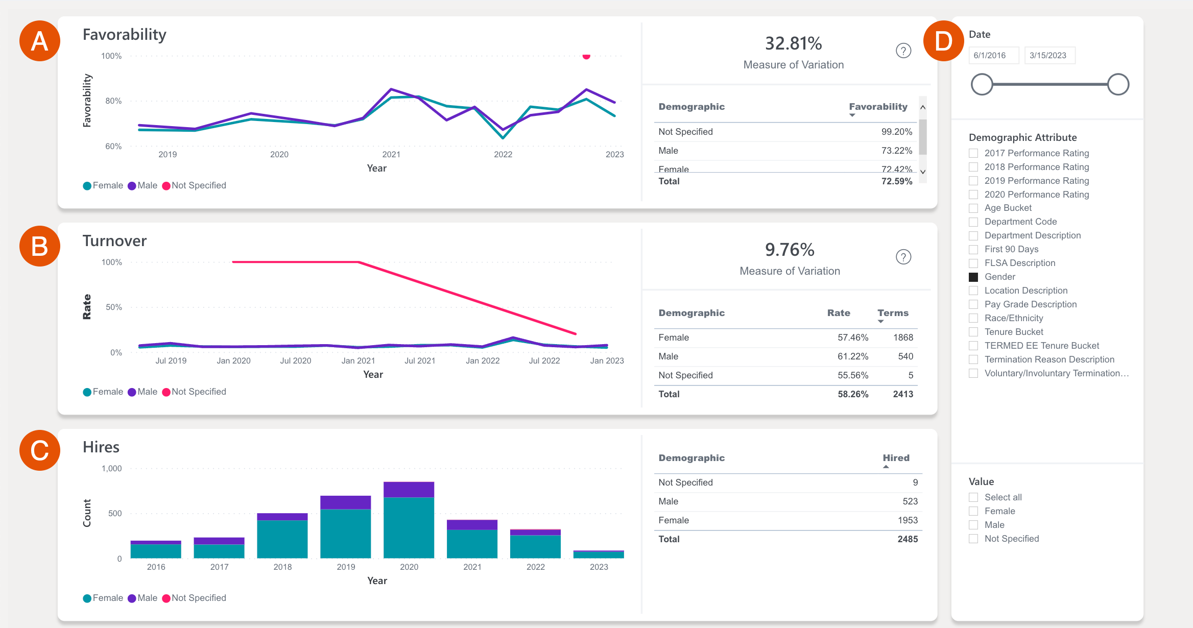
- A. Favorability: For the selected demographic, view a visual for favorability, as well as the measure of variation between each enabled value
- B. Turnover: For the selected demographic, view a visual for the rate of turnover over time, as well as the measure of variation between each enabled value
- C. Hires: For the selected demographic, view the hire count over time, and a number count for each demographic value
- D. Graph Settings: Configure these settings to view the data in Figures A-C with the active filters