Highlights Enhancements
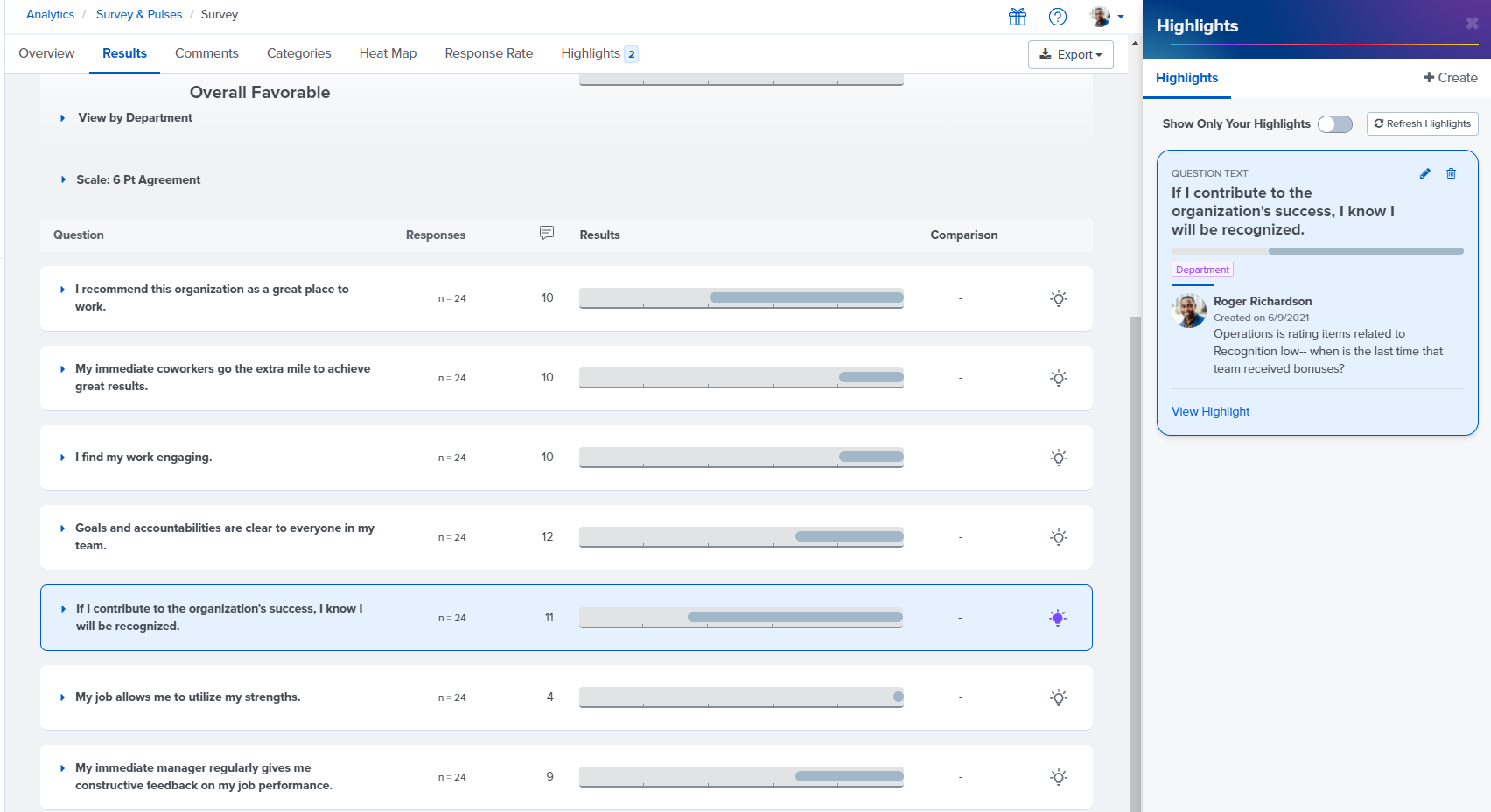
We have made two enhancements to our Highlights tool in Surveys & Pulses that allows you to flag interesting data points in your survey for your colleagues' future reference:
1. It's now possible to add highlights to survey results that are sliced by automatically calculated demographics such as generation and tenure.
2. Now when you click on a highlight to view it, the survey item that you've highlighted will automatically appear to the left of the highlight. This allows you to easily see which survey result, slice, or filter corresponds to each highlight without scrolling through your survey results.
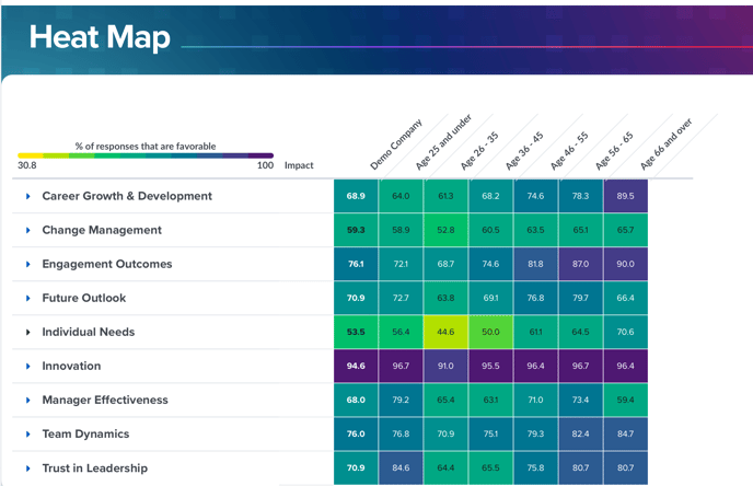
Heat Map Now Includes Legend
The Heat Map within Surveys & Pulses Analytics now includes a legend in order to help you understand your results. The Heat Map provides a visual representation of how survey results differ between different demographic groups in your organization (e.g. different departments, generations, or tenure groups).
Goals: Key Results Field Expands to Accommodate Text
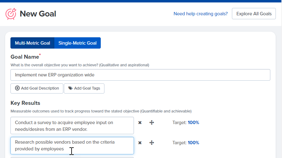
The key results fields on the goal creation page now automatically expand as you type to ensure that you can see the complete text within each key result while you set up your goal.
Manager Analytics Email No Longer Includes "About this Survey" Text
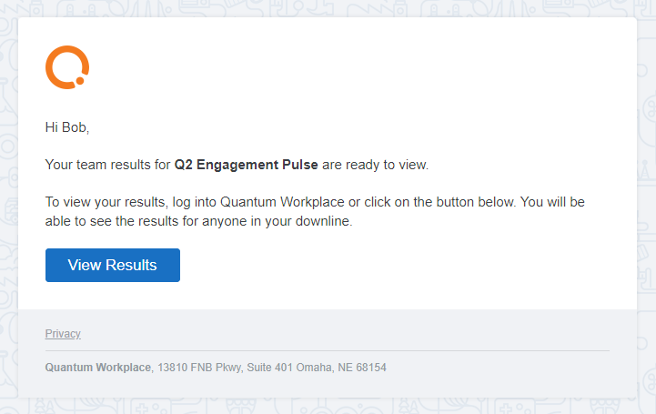
Previously, the email notification that managers received when they gained access to survey results for their downline included text from the "About This Survey" field, which typically includes a description of the survey or instructions for survey takers.
Including the description of the survey in this email made it unclear to managers whether they needed to complete the survey or view their team's survey results. We have removed this text to ensure that the managers' call to action to review their team's results is clear.