In this Article:
What is the Items Report?
Chart View
Compare To
Slice/ Filter
What is the Items Report?
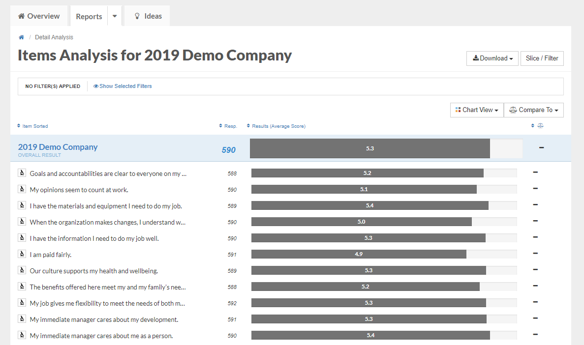
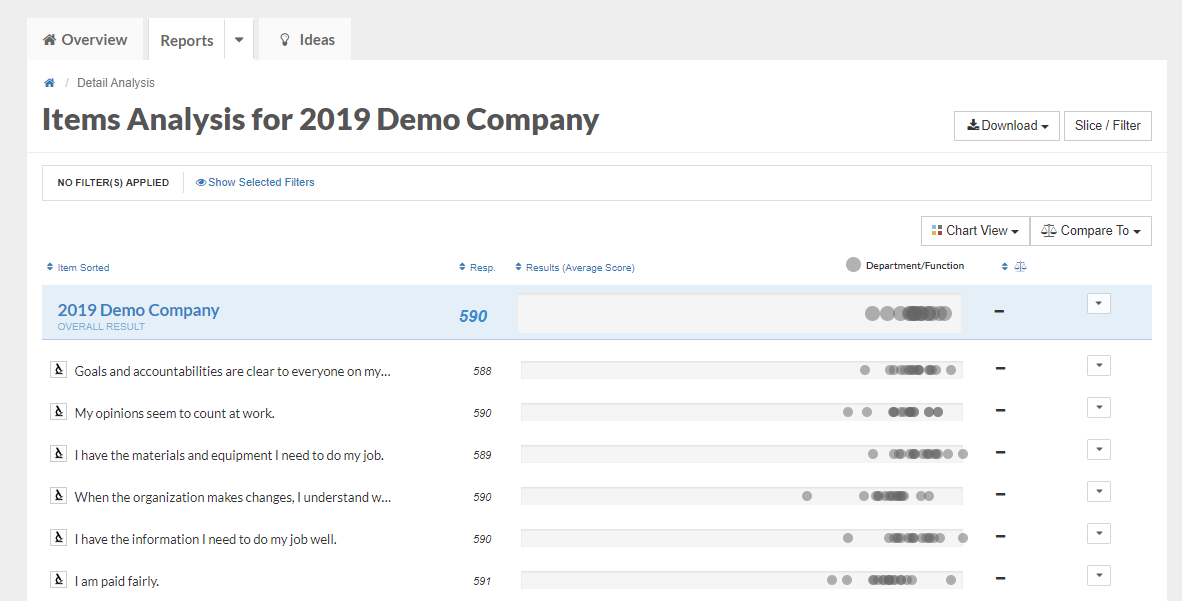
With the exception of any open-ended questions (e.g. questions that require text responses), your survey is made up of scaled agreement items, which require the survey-taker to rate how well they agree or disagree with a specific statement about your workplace culture, on a scale from strongly disagree to strongly agree. The Items report displays how your employees rated each of these questions on average.
You want your scores on scaled agreement items to be as close to 6 as possible; a score of 6 on a particular question would indicate that everyone who took the survey responded Strongly Agree to that question.
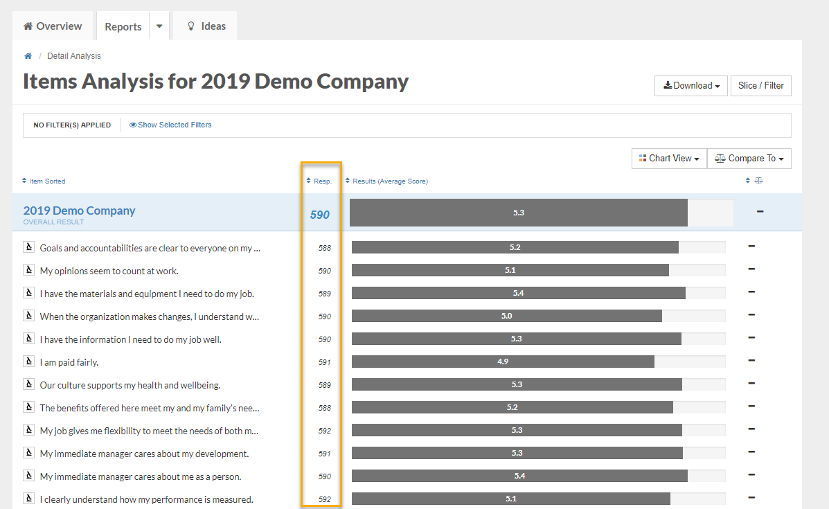
The left column shows the text of each question. To the right of the question text, you can see the number of people who responded to that item on the survey:
To view data for a particular question in isolation, click on the microscope to the left of the question text. This view provides a few best practices related to that question from our Ideas Library:
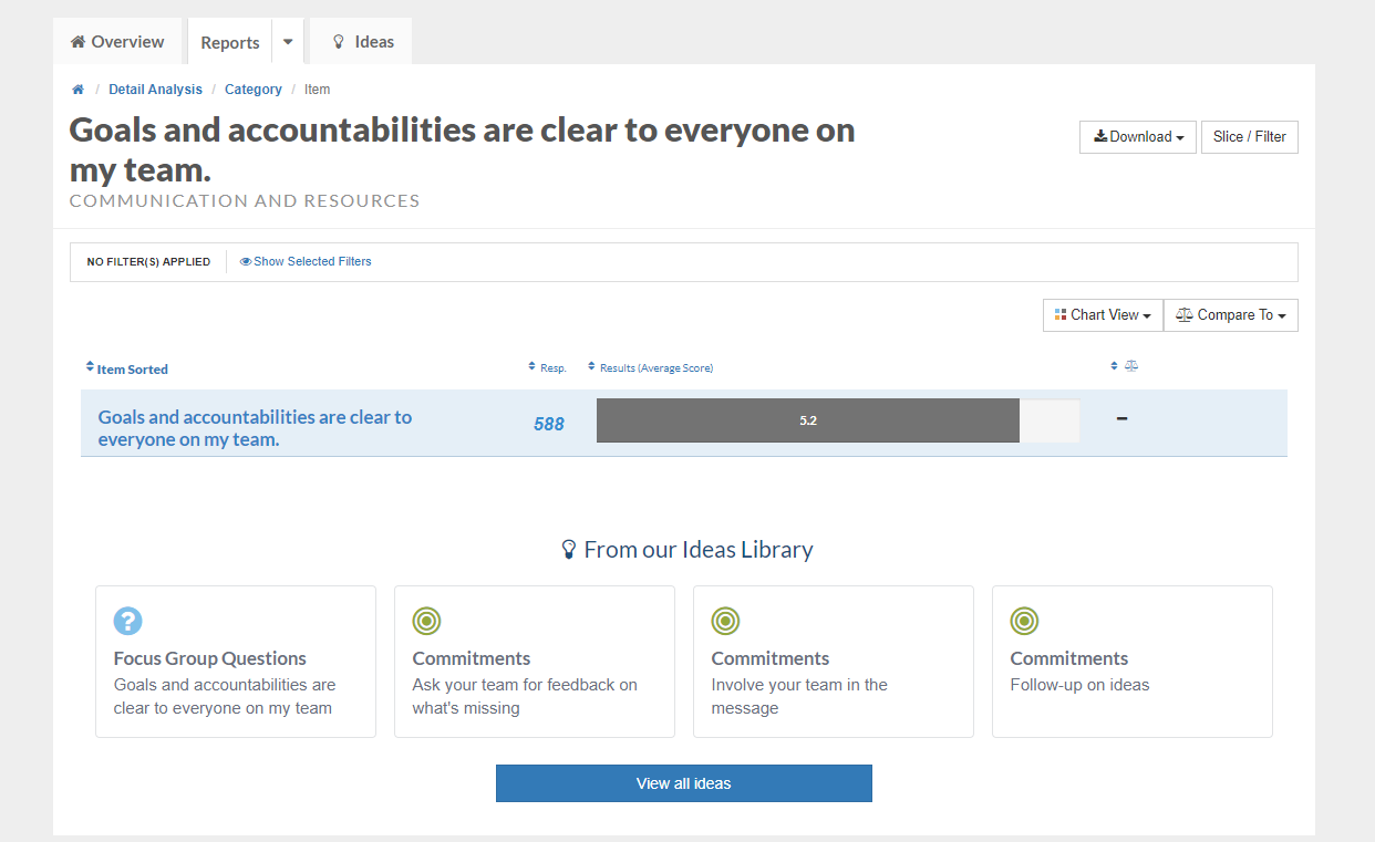
Chart View
The Chart View button allows you to change the way you view your data. You can switch from viewing the average score for a question to viewing questions by favorability (where Favorable Responses represents the percentage of Strongly Agree and Agree responses for each question on the survey). We recommend viewing your data by either Average Result or Favorable Responses.
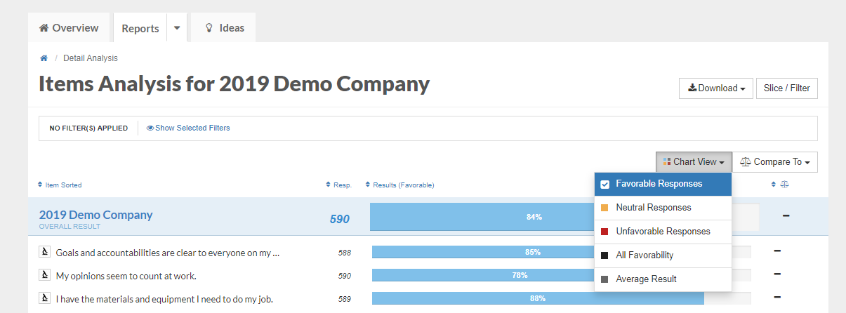
Set your Chart View to either Favorable Responses or Average Result in order to use the Compare To (Benchmarks) or Slice/ Filter functions.
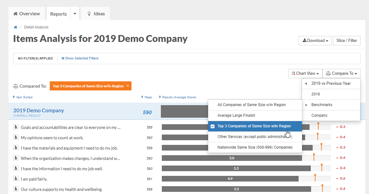
Compare To (Benchmarks)
The Compare To button allows you to compare your data from this year's survey to your results from prior years (if applicable) and compare your data to organizations in your industry or organizations the same size as yours that have participated in Best Places to Work.
To begin, click the Compare To drop down menu. Any comparison you select will generate a data point representing that group's average score for each question.
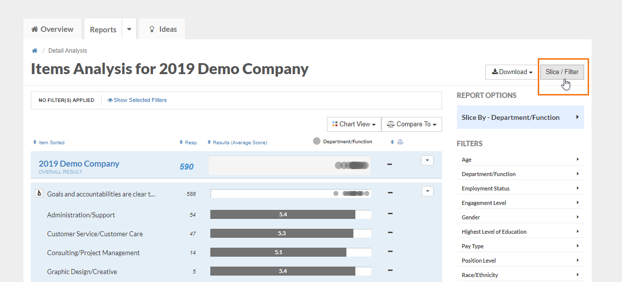
Slice / Filter
The Slice/ Filter function allows you to view how survey responses varied between different groups, or demographics, of your organization. Click the Slice/Filter button in the top right corner to begin.
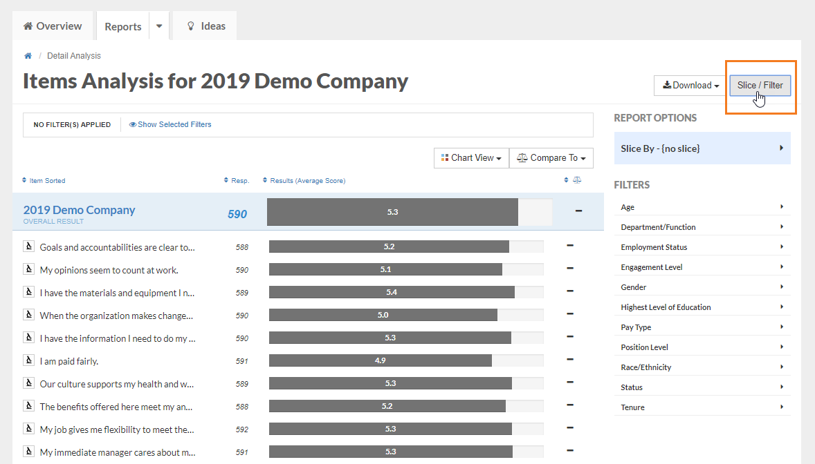
Under the Filters heading, you will see a list of the employee demographics that you provided for your employees as part of the survey set up process.
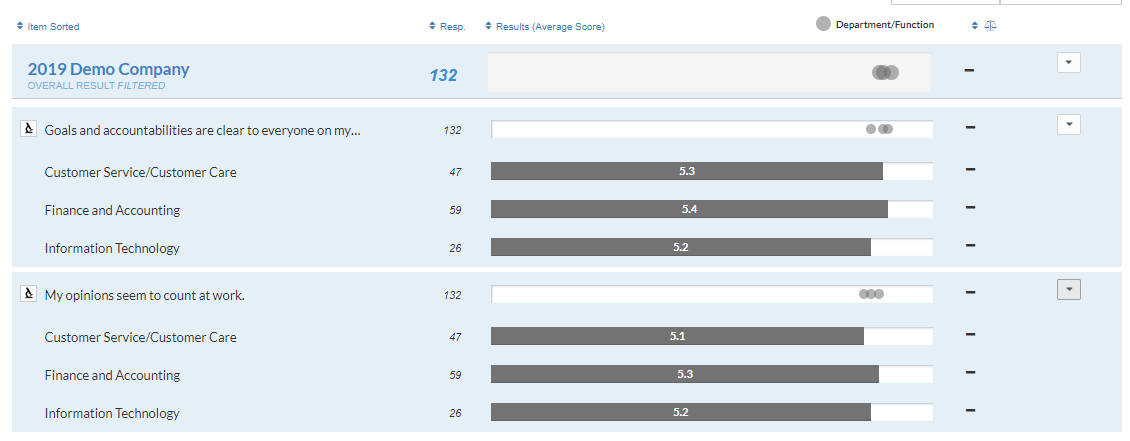
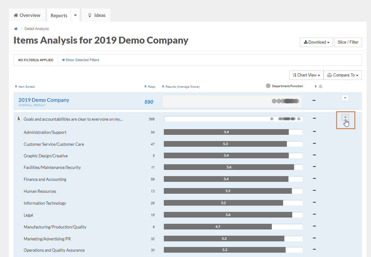
Under the Slice By heading, you can select a demographic (e.g., Department/Function) in order to view a data comparison for all the Department/Functions across your organization. To apply a slice, first click the Slice By header and then click on the demographic you wish to examine: 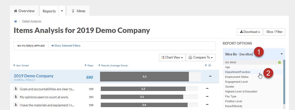
Once you have clicked your demographic (e.g., Department/Function), you will see a data point representing how each Department/Function responded to every survey question.
You can hover over any data point to see which Department/Function it represents, or click the drop down arrow on the right to view exact scores for each Department/Function.
Additionally, you can use the Filter function to view data for 1 or more particular demographic groups in isolation. Since your data is sliced by Department/Function, you can now use the Filter function to narrow down which Departments/Functions you're viewing. Click on the Slice/ Filter button again to reveal the list of Filters available.
Next, click on Department/Function and select the specific Departments you want to view in isolation. Click the Apply Button:
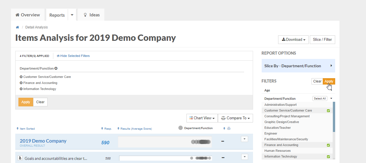
Now you can see the scores for those departments you have selected: