IN THIS ARTICLE:
- Quick Step-by-Step: Give me the shortened version on what I need to know.
- Full Notes: I want an in depth walk-through of the report functionality.
- Tips & Tricks: What else should I know?
Quick Step-by-Step Notes
Filter
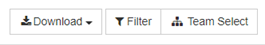
- Click on the Filter button.
- To filter by a demographic, scroll down and click on the demographic you want to filter by. Then click on the options you want to select them. Finally, click the Apply button.
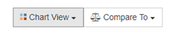
Chart View
- Click on the Chart View button.
- Pick the option you want to see – Favorable Responses, Neutral Responses, Unfavorable Responses, All Favorability, Average Result.
Compare
- Click on the Compare To button.
- Pick your option. You can pick your previous year if you’ve surveyed with us before, benchmarks, or your organization as a whole.
- You will see a pin for the comparison option you picked. Hover over it to see more details.
Full Notes
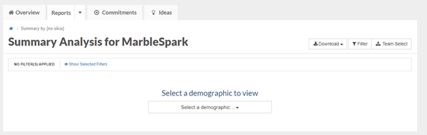
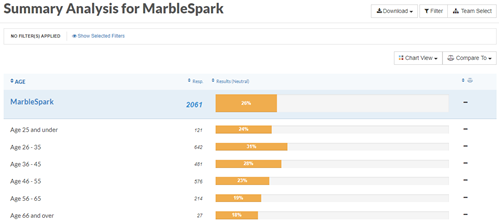
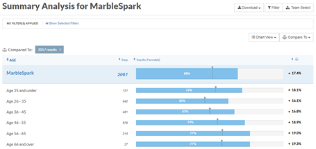
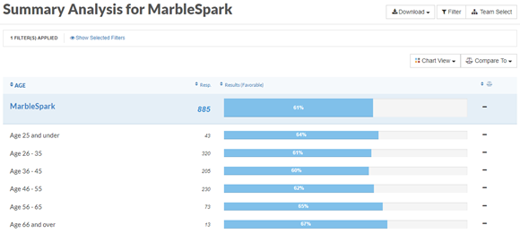
When you first land on the Summary report, you will be prompted to select a demographic (unless you already have a slice turned on).
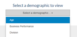
Click on the Select a demographic drop-down list and choose the option by which you want to slice.
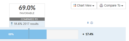
The overall favorability for each option under the selected demographic will display.
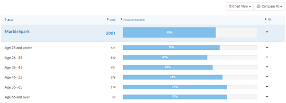
From here, you can sort the report from low-to-high and high-to-low by click on the Results heading.
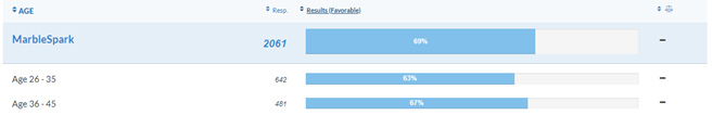
Chart View
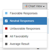
By default, we display favorable responses on our reporting site. You may use Chart View to view favorable, neutral, or unfavorable responses. You can also view all favorability and the average results.
- Click on the Chart View button.
- Select the option you want to see. In the example below, we picked Neutral Responses.
- The Summary report will update to show the option you picked.


- The Summary report will update to show the option you picked.
Compare To
If you want to compare to your previous year’s results, your organization a whole, or benchmarks you can do that too!
- Click on the Compare To button.
- Pick the option you want to compare to (we picked 2017 results below).
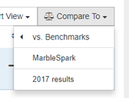
- You will see a pin for the comparison option you picked.
- If you hover over the pin, you will see a pop-up with all of the details of the comparison.
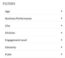
Adding a Filter
To focus in further on a specific population, you can also apply a filter(s) to this report by clicking on the Filter button in the upper, right-hand port of the screen.
- To Filter by a demographic, click on the Filter button.
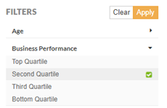
- This time, under Filters, click on the demographic you want to filter by.
- Select the options for that demographic (Second Quartile in the example below) and then click on the yellow Apply button.
- The Summary report will update based on the demographic you selected.
- If you select two (or more) options for a specific demographic, the report will display the combined results for each option selected.
Tips & Tricks
- For the Summary report to work, you must have a slice turned on.
- You can add a filter to the Summary report and can apply as many filters as you like.
- Don’t forget about our minimum threshold. If you filter down to fewer than 5 responses, you will get our insufficient responses message.
- To get rid of a filter, click on Filter again and then click on the Clear button.